
Case study: Creating a responsive, user-friendly booking flow
Briefed to redevelop the booking flow on this leading travel website, which had originally been created in-house. The requirement was to create a mobile-friendly, user-centred solution, as part of a wider migration and upgrade to a responsive website solution.
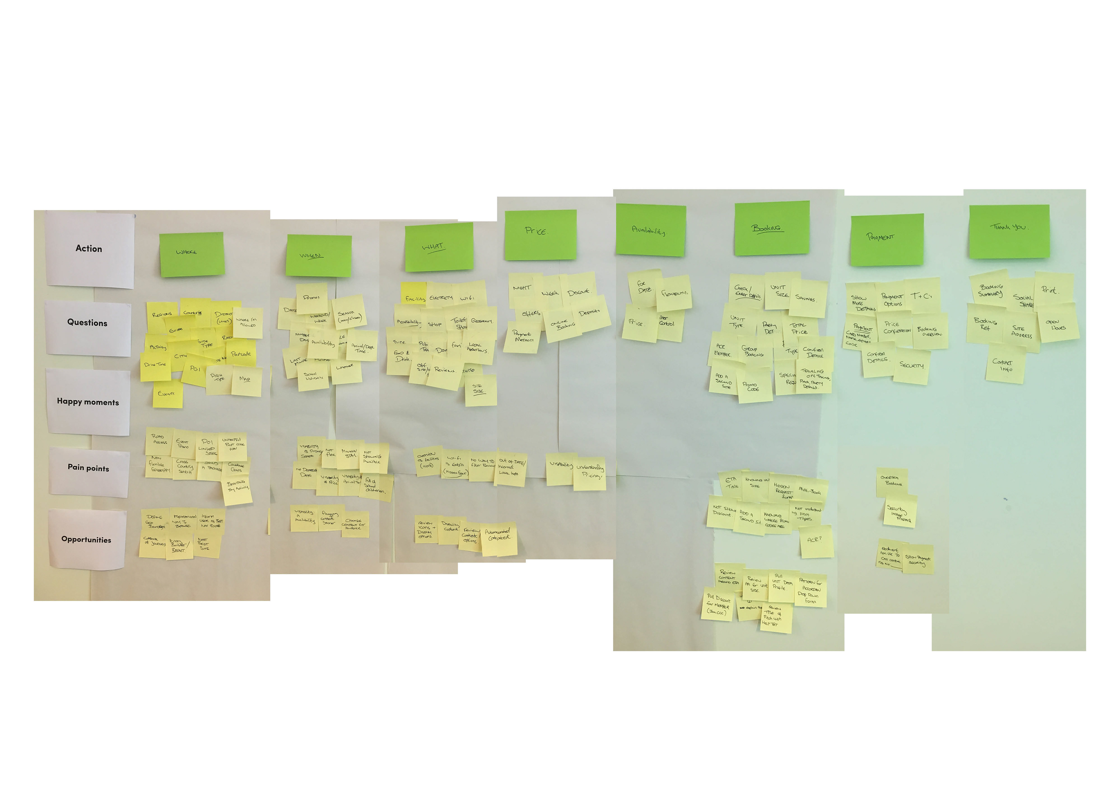
Output of user research sessions to understand the previous experience of the booking journey
Method
I conducted a series of workshops and interviews with service users and stake holders to visually map the user's experience.
from the initial search for campsites to completing a booking, we gained insights into the emotional highs and lows at each stage of the journey. This approach highlighted key pain points, such as confusing navigation and unclear payment steps, which often caused frustration. By addressing these issues, we were able to streamline the booking flow, ensuring a smoother, more intuitive experience. The journey map also helped align design decisions with user expectations, ultimately creating a more satisfying and efficient booking process that improved both user engagement and site performance.
By mapping out the key user tasks—such as searching for campsites, selecting dates, and completing reservations—the task model helped identify pain points and areas where users encountered friction. It highlighted redundancies in the booking process and allowed us to streamline actions, reducing unnecessary steps. This approach ensured that the redesign was more intuitive, focusing on improving usability and guiding users through a seamless, efficient booking experience that met their needs with minimal effort. The result was a more user-friendly website, increasing conversion rates and overall satisfaction.
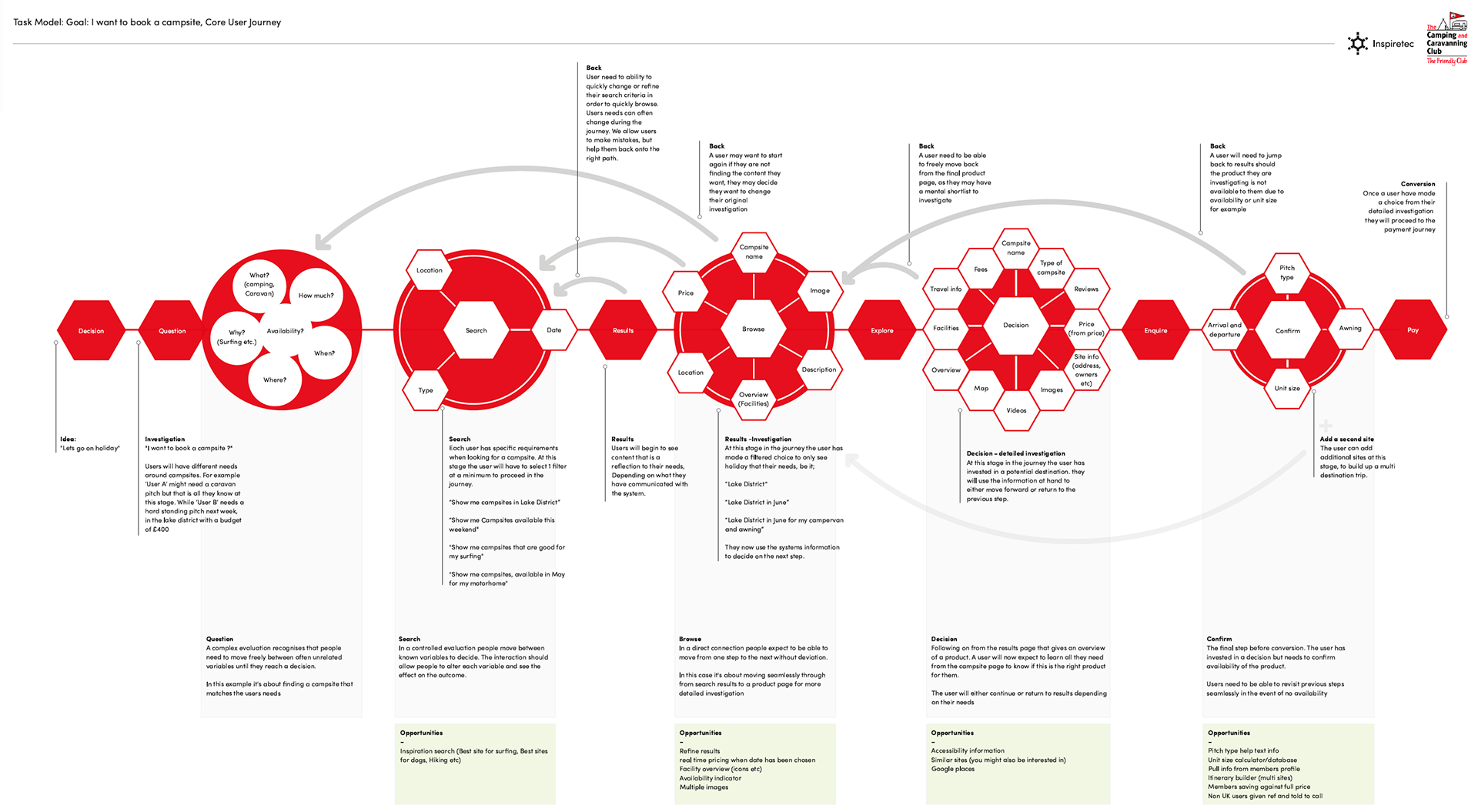
Task model of the new booking flow to conversion
I utilised the insights gained from developing a customer journey map to address key user pain points and identify opportunities for improvement. The journey map allowed me to fully understand the experiences and challenges faced by users when navigating the site, from the initial search to the final booking.
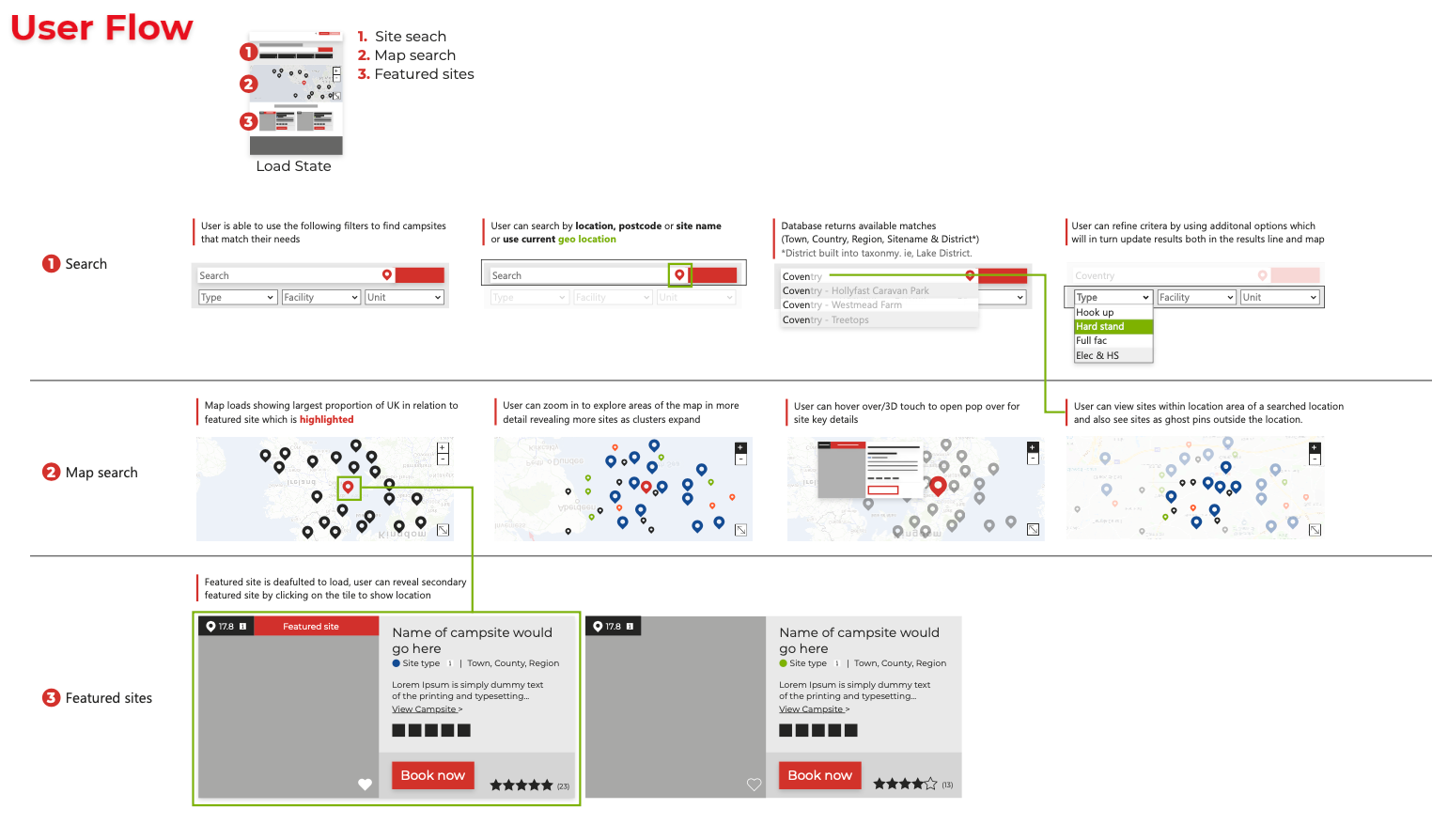
A user flow showing the multiple roots to a conversion
Using this information, I created low-fidelity wireframes to visualise potential solutions, focusing on simplifying the search and booking process. These wireframes were tested with real users to gather feedback and validate assumptions early in the design process. Testing allowed me to refine the flow, ensuring it was intuitive and addressed the pain points uncovered during the journey mapping phase.
By streamlining the site architecture and improving the user flow, the final design led to a smoother, more user-friendly experience. The improved search functionality and booking process resulted in a 20% increase in annual website bookings, showing the direct impact of user-centred design on business performance.
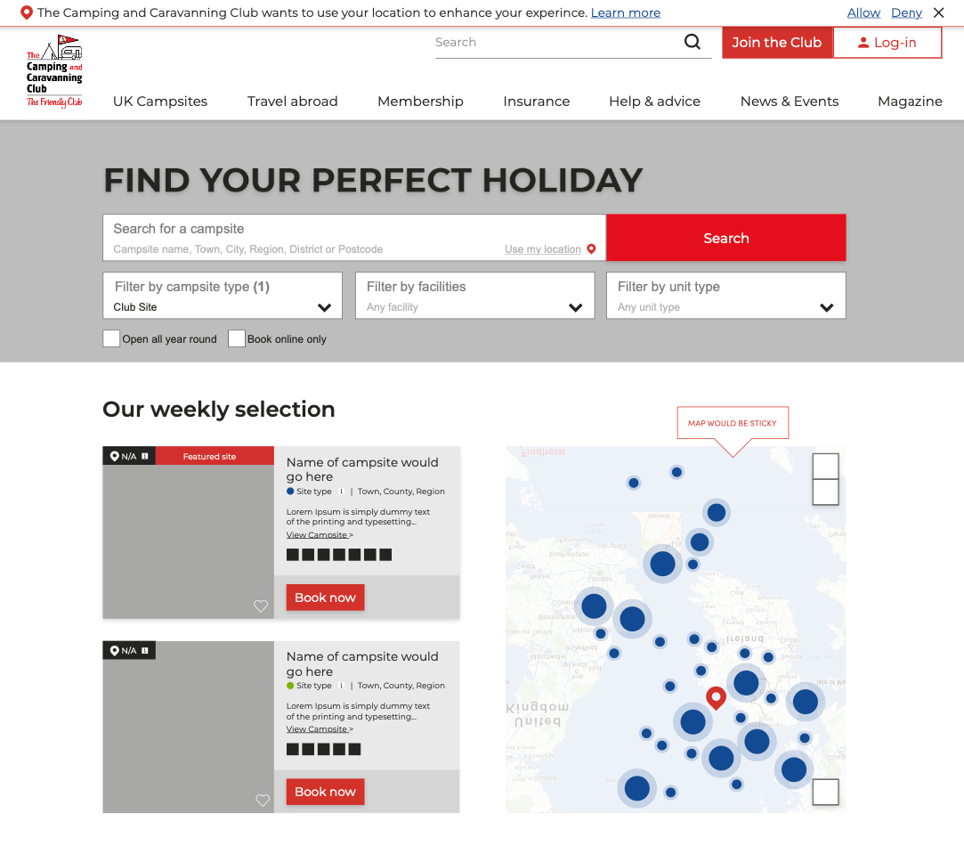
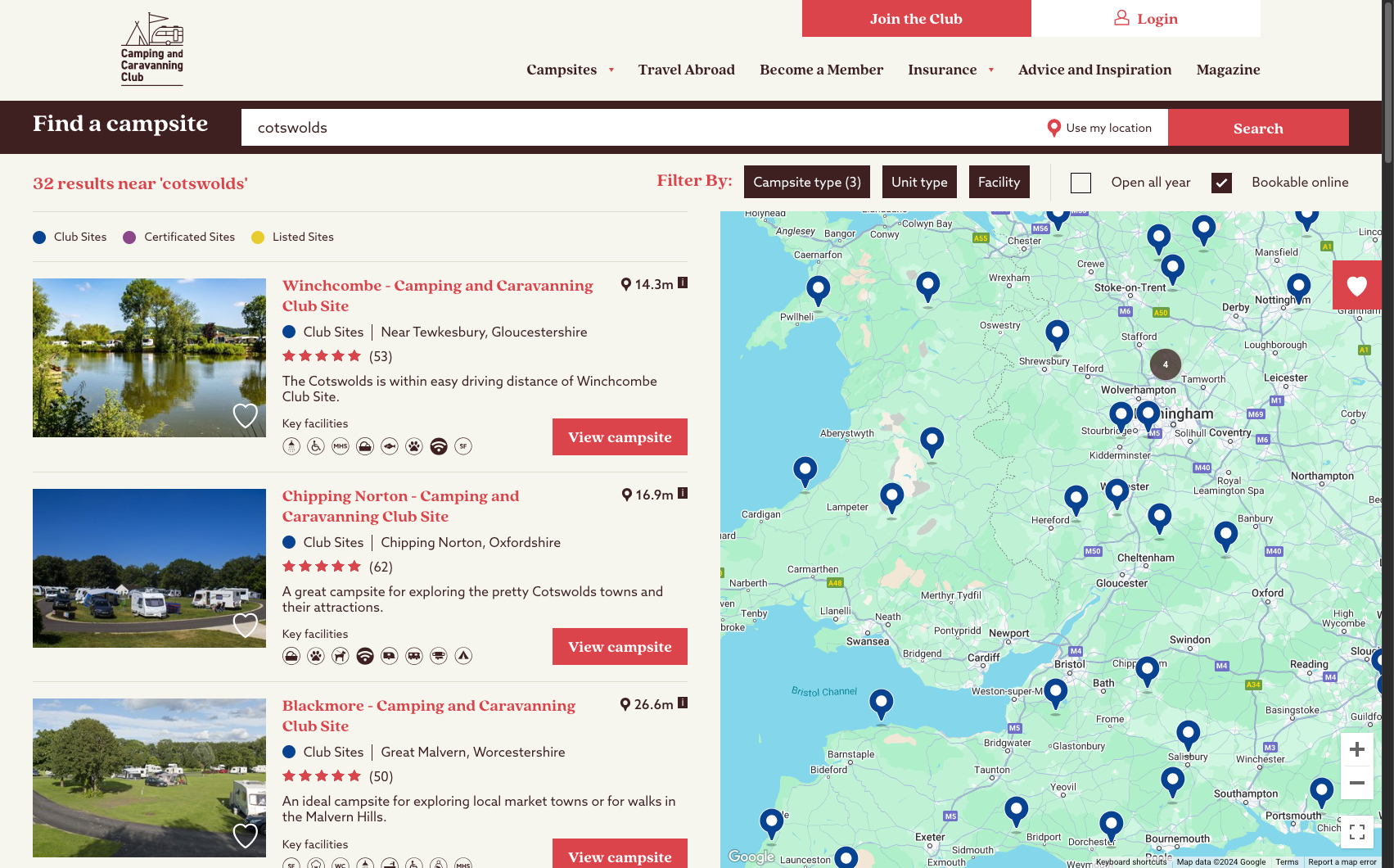
A wireframe of the new website showing search and filter options and quick conversion CTA's
Outcome
The newly designed, responsive booking flow resulted in a significant improvement in user engagement and conversions. Within just three months of going live, the redesign achieved a 30% increase in the conversion rate, demonstrating the effectiveness of the user-centered approach. The streamlined process reduced user friction, making it easier and faster for customers to search for and complete bookings across all devices.
By focusing on simplifying the journey and providing clear guidance throughout the process, we addressed key pain points, leading to higher satisfaction and reduced abandonment rates. The data shows that both mobile and desktop users benefited from the enhanced design, with notable improvements in overall engagement and successful bookings. This outcome highlights the positive impact of the redesign on business performance, as well as the value of investing in a more intuitive, accessible user experience.
Screenshot showing part of the new search and book journey