
Case Study: Redesigning the Turquoise Holiday Company Website
Overview
The Turquoise Holiday Company is a luxury travel agency specialising in tailor-made holidays, honeymoons, and bespoke travel experiences. The website plays a crucial role in their business, serving as the main point of interaction for potential customers researching and booking high-end, personalised holidays.
The goal of the redesign was to improve the user experience (UX) by focusing on site architecture and navigation to lead to more direct enquiries—the primary conversion metric for the company. By making the site easier to navigate and more intuitive, we aimed to streamline the journey from browsing destinations to contacting the team for a bespoke quote.
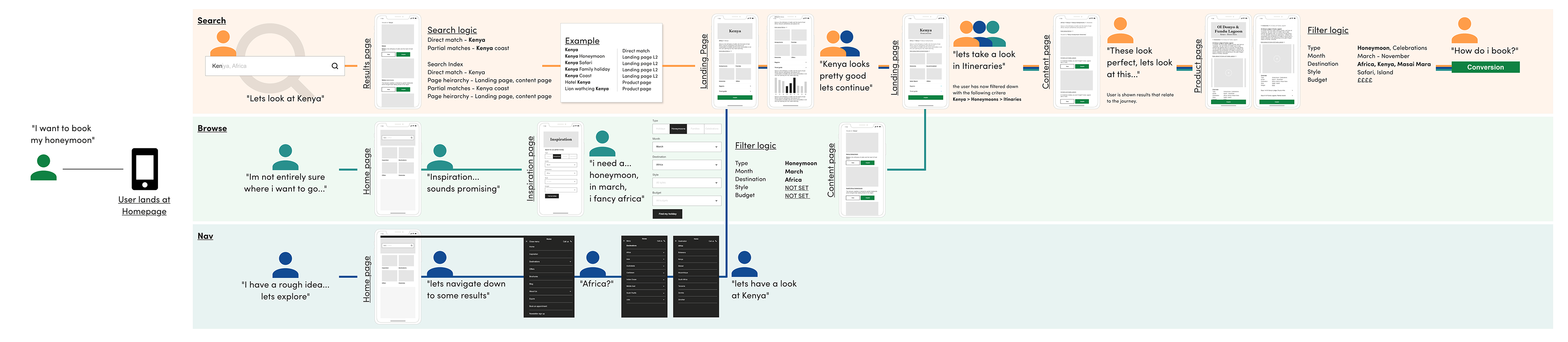
A task modal showing the break down of user behaviour up until conversion
Challenges
Before the redesign, the Turquoise Holiday Company’s website faced several challenges:
Complex Site Structure: The previous architecture made it difficult for users to find specific destinations or holiday types quickly.
Disjointed Navigation: Users often got lost or overwhelmed due to multiple layers of menus and an unclear path to key information.
Low Conversion Rates: Despite strong traffic, the number of direct enquiries was not meeting the company’s expectations, suggesting that users were leaving before reaching out for a quote.
Objectives
The primary objectives of the redesign were to:
Simplify the site architecture to make it easier for users to find relevant content quickly.
Improve navigation by creating a more intuitive menu structure and clear user journeys.
Increase conversions by streamlining the process of finding and enquiring about bespoke holidays.
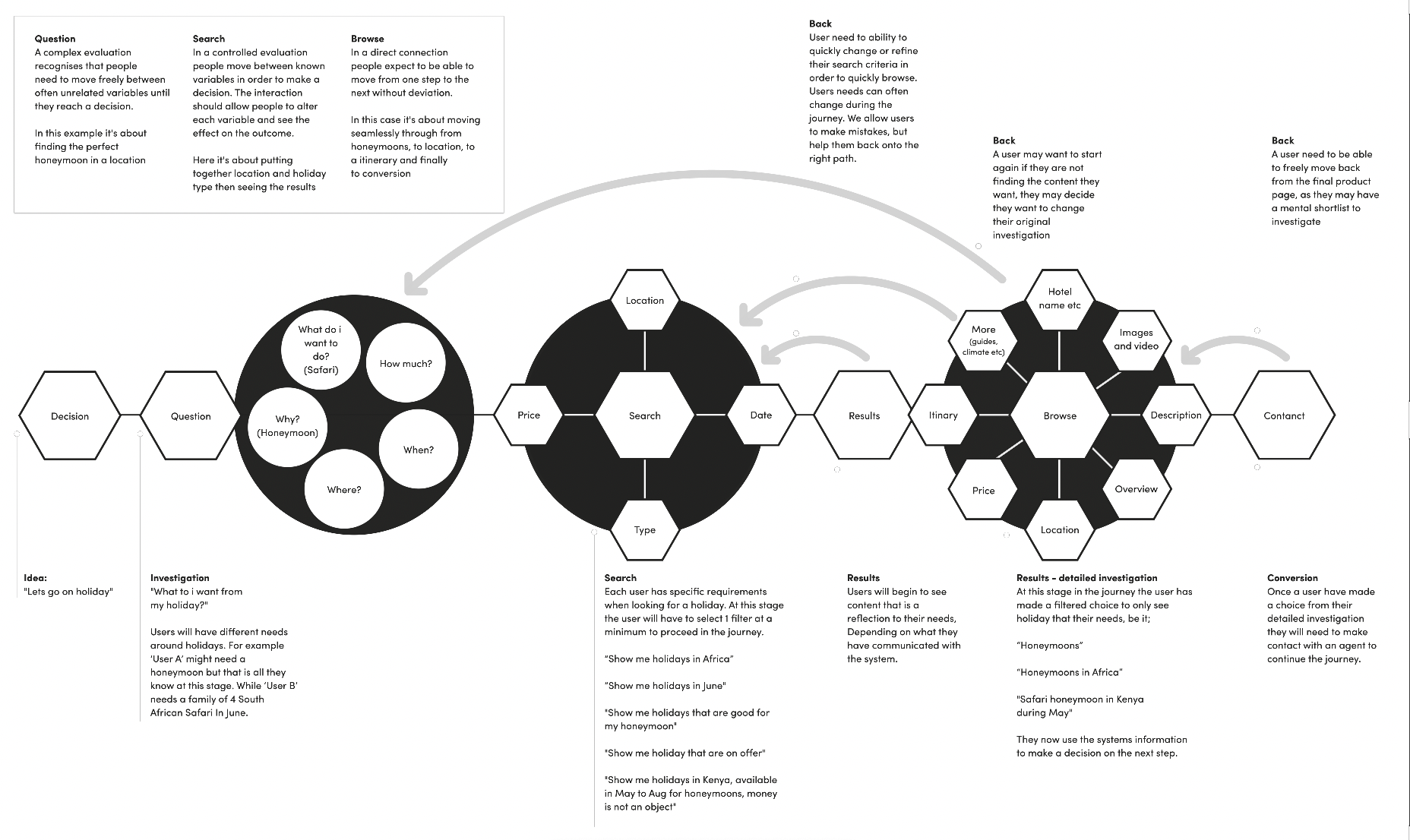
A user journey map showing the proposed changes to the site structure focusing on a simple architecture to improve conversion
Research & Discovery
We began the project with a detailed discovery phase, conducting user research to understand the key pain points faced by both new and returning users. We also performed a site audit to analyse the existing structure, user flows, and how content was organised.
Key insights from the research included:
Users found the existing menu structure too complex, leading to high bounce rates on key landing pages.
Many users wanted clearer paths from browsing inspiration to making a direct enquiry.
There was a need to highlight the bespoke nature of Turquoise’s offering and guide users towards speaking with an expert rather than getting lost in overly detailed information.
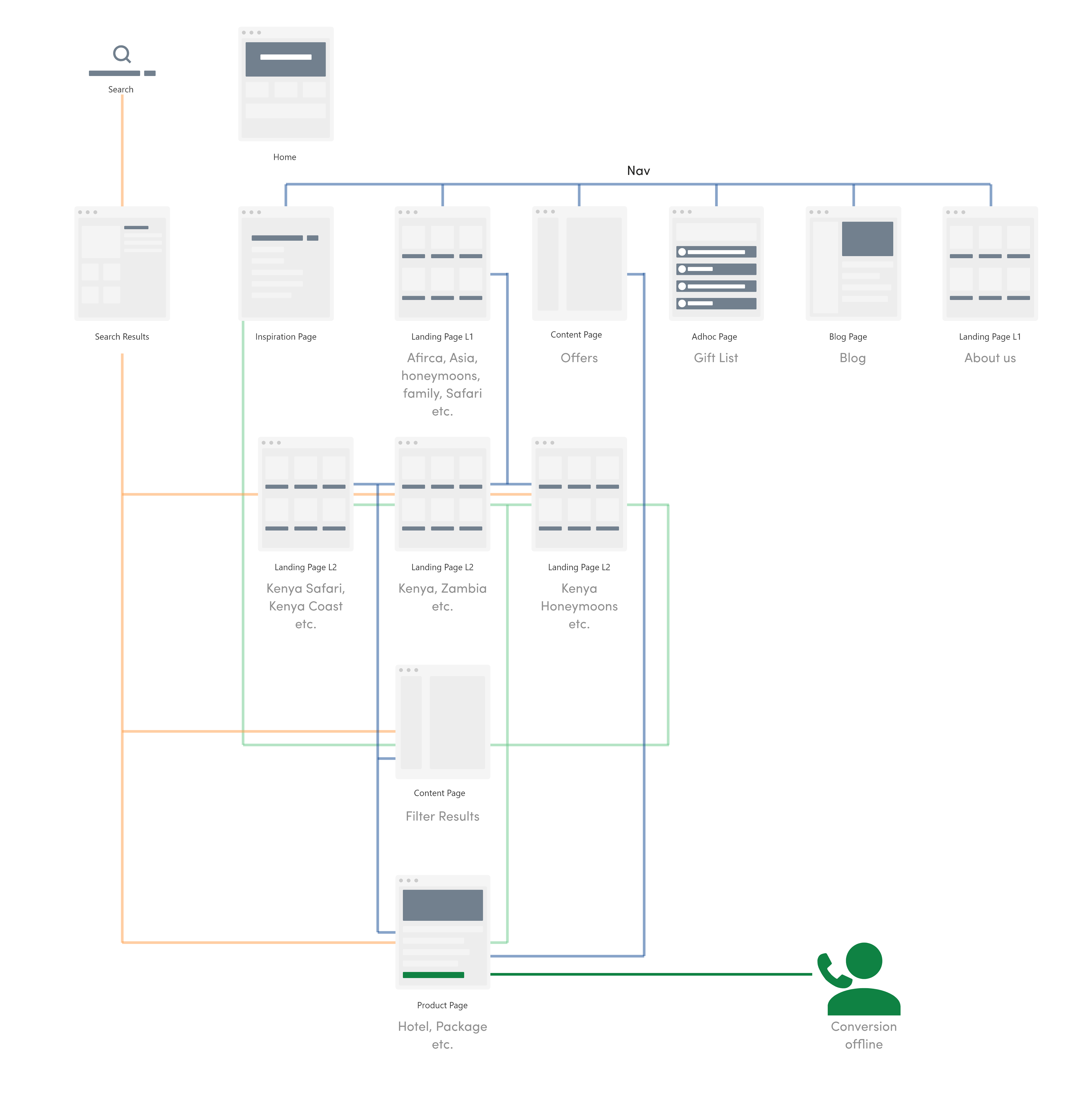
The new proposed architecture that allows simple navigation with accelerators to conversion
Design Approach
1. Simplifying Site Architecture
The first step was to reorganise the site architecture to make the user journey more seamless. We created a more logical hierarchy that allowed users to easily navigate through different sections of the site:
Destinations and Experiences were made central to the structure, enabling users to quickly browse and explore holiday types and destinations.
Clearer Calls to Action (CTAs): Each page was designed to lead users towards making a direct enquiry, with prominent CTAs placed strategically throughout the site.
2. Improved Navigation
The navigation overhaul included:
Menus that allowed users to see all destinations and holiday types in one glance, reducing the number of clicks required to find specific information.
Breadcrumbs and intuitive filtering systems that ensured users always knew where they were on the site and could quickly return to other sections.
Optimised Search Functionality: A powerful search tool was implemented to help users find destinations, experiences, and expert guides faster.
3. Focusing on Direct Conversions
To increase the number of direct enquiries, we made strategic design decisions:
Enquiry Forms: Enquiry forms were simplified and made more visible on key pages. Every destination or holiday type page had a clear CTA encouraging users to enquire directly for bespoke advice.
Highlighting Expertise: We emphasised Turquoise’s unique selling point—the expertise and personal service of their team—by featuring travel consultants prominently on pages and encouraging users to contact them directly.
Mobile-First Design: Recognising the increasing number of users accessing the site via mobile, we ensured that the mobile experience was optimised, with fast loading times, easy navigation, and a clear path to making an enquiry.
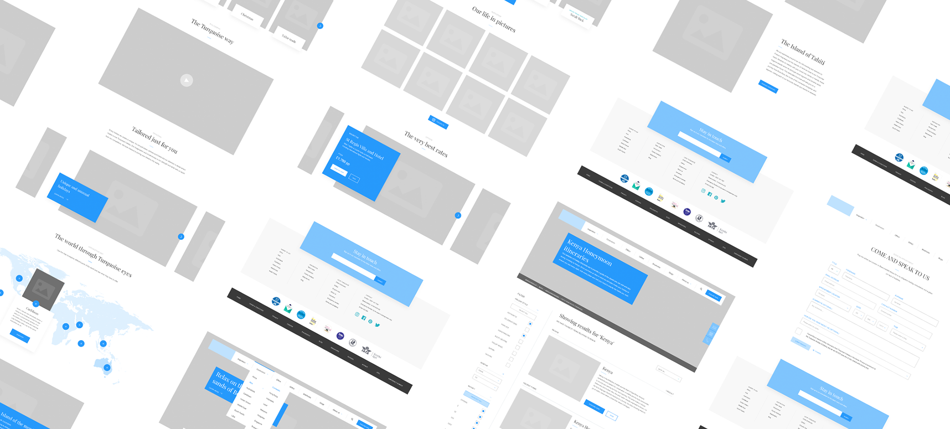
Wireframes used to usability test conversion scenarios with users
Outcome
The redesigned Turquoise Holiday Company website delivered outstanding results in terms of user experience and conversions:
Simplified Navigation: The new architecture and navigation structure made it significantly easier for users to browse and find information. User feedback indicated that they could find their desired destinations more quickly, reducing frustration and bounce rates.
Increased Direct Enquiries: Since the launch of the new website, there was a 25% increase in direct enquiries within the first three months. The simplified journey from discovery to enquiry resulted in a more intuitive and efficient process for users.
Enhanced User Engagement: With clearer content, optimised search tools, and more direct paths to making enquiries, the overall engagement on the site improved. Users spent more time on the site, exploring various destinations and experiences before reaching out to Turquoise's travel experts.
Conclusion
The redesign of the Turquoise Holiday Company’s website successfully transformed the user experience by improving site architecture, enhancing navigation, and optimising for direct conversions. By creating a more intuitive journey for users, we helped Turquoise increase their engagement and conversions, positioning the company for continued success in the competitive luxury travel market.
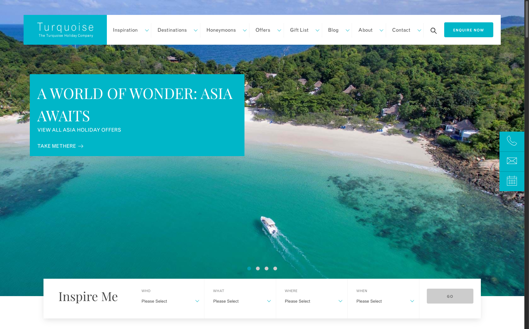
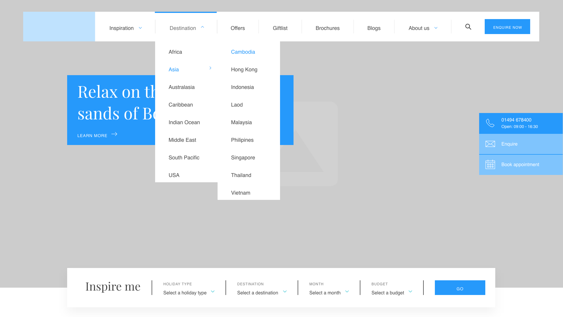
A screen from the live website which sits on tops of the redesigned architecture